How the homepage visual language can signal spatial intelligence without turning the site into a heavy demo page.
spatial intelligencevisual designthree.js
Why Move the Demo Into the Hero
The spatial visual should work as identity, not as a separate toy. A clean academic homepage benefits from one strong first-viewport signal: a real Earth surface, restrained motion, and a calm reading surface for the research narrative.
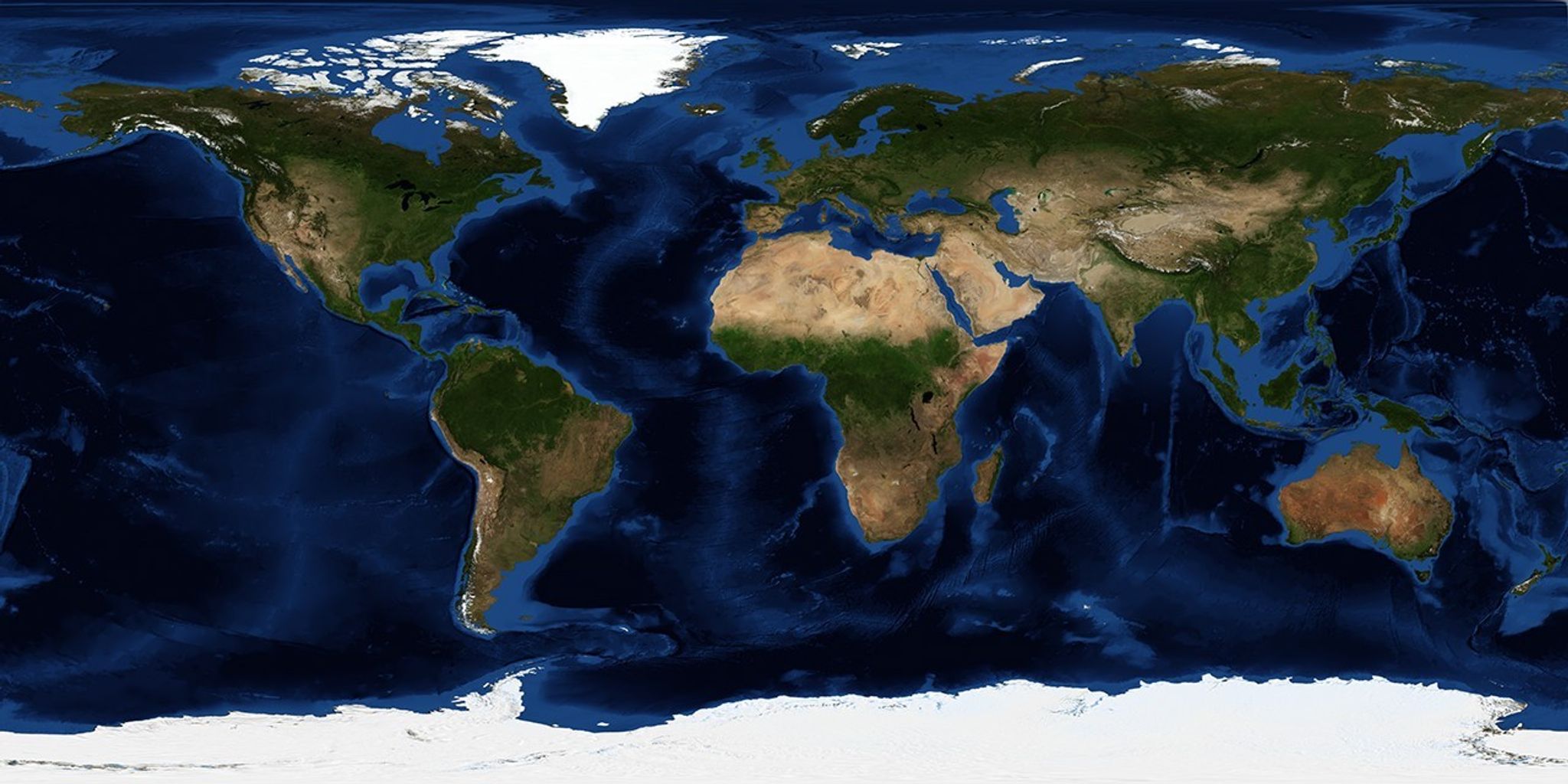
NASA Blue Marble imagery provides a real satellite texture for the homepage globe.
Visual Constraints
The globe should sit behind the text, not compete with it.
Motion should be slow enough to feel ambient.
Reduced-motion users should not be forced into continuous animation.
The fallback should still look intentional if WebGL is unavailable.
Next Iteration
Later versions can add subtle trajectory arcs, publication-linked geographies, or project-specific spatial layers. Those should stay quiet enough that the homepage remains readable.